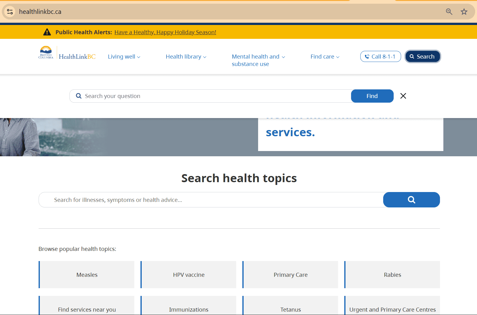
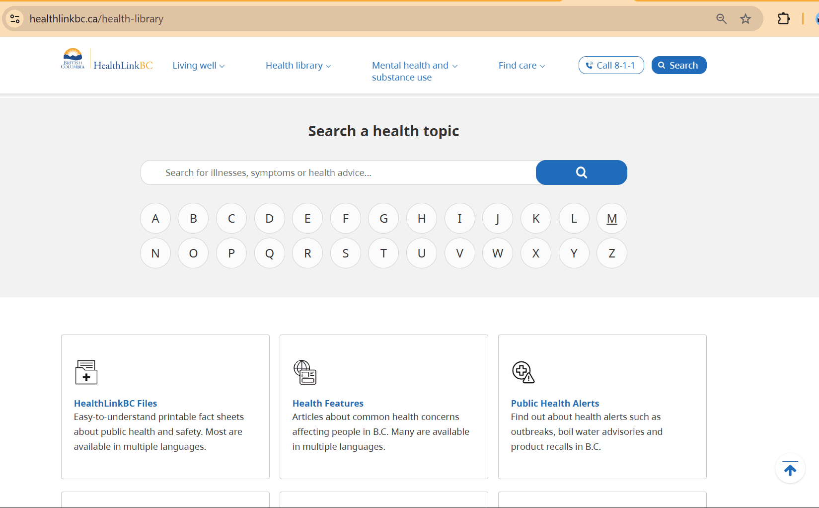
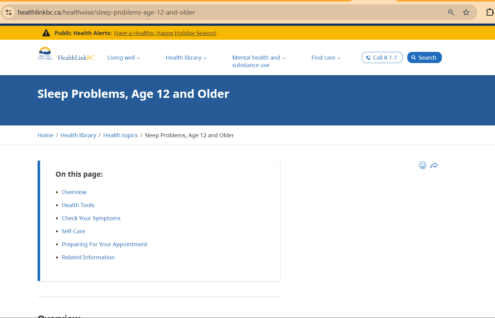
Our client, HealthLinkBC is a core resource for citizens of British Columbia to find health-related answers. A popular tool is 8-1-1 nurse phone line that may connect citizens to the HealthLinkBC website.
Timeline
From discovery, prototyping, discussing with client's team, to final designs — it took 2 years, while working with multiple projects at the same time.
Objectives
This website's redesign aims to empower individuals with varying levels of technological literacy and accessibility needs to independently navigate and wayfind information before contacting the nurse phone line.
Team
2 designers
3 business subject matter experts (clients)
I worked closely with clients to gather requirements, conducted remote user research, and produced interactive prototypes for validation, user testing, and development handoff.
Research & Insights
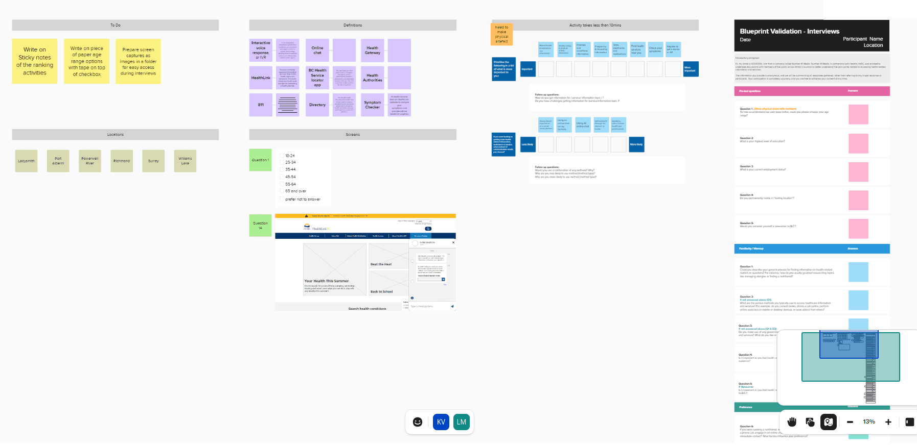
We designed a mixed method research approach combining remote interviews and large-scale quantitative testing across the province.
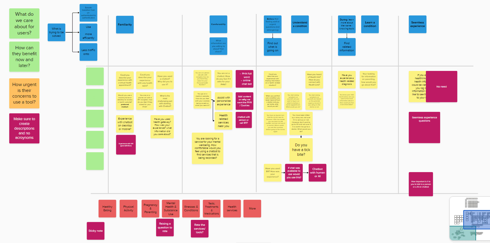
I designed conversational research prompts combining card sorting, Likert-scale, and open-ended questions to gather both behavioural patterns and contextual nuance tied to participants’ lifestyles, current searching behaviour, access to technology, and awareness of government health resources.
In parallel, I designed a tree-testing study with realistic scenarios in Optimal Workshop to evaluate a two-level information architecture with over 80 participants from the public and HealthLinkBC team.
Synthesizing qualitative narratives with quantitative results revealed that “incorrect” navigation paths were often contextually valid, leading to the insight that the service required multiple entry points to support diverse mental models and interpretations of health topics.
Design & Prototyping
I designed an Axure interactive prototype to test the proposed direction:
(1) Visitors were given multiple entry points, with an emphasis on direct search, while the navigation information architecture was informed by research findings.
(2) Create pathways that were not overwhelm decision making when learning about resources that they might not know existed, but would benefit them.
(3) Understand what the website's purpose is.
Challenges
While designing the next set of designs, there were conflicts that had occurred:
(1) Was it necessary to have the politically correct government terminology instead of using plain-language that citizens would understand?
(2) There was changes in the product owner and requiring higher up approval on the client side, that caused there to be delays on reviews.
(3) Uncertainty on the third-party health content provider will be, therefore unsure how many levels will be required for navigation.
Testing & Optimization
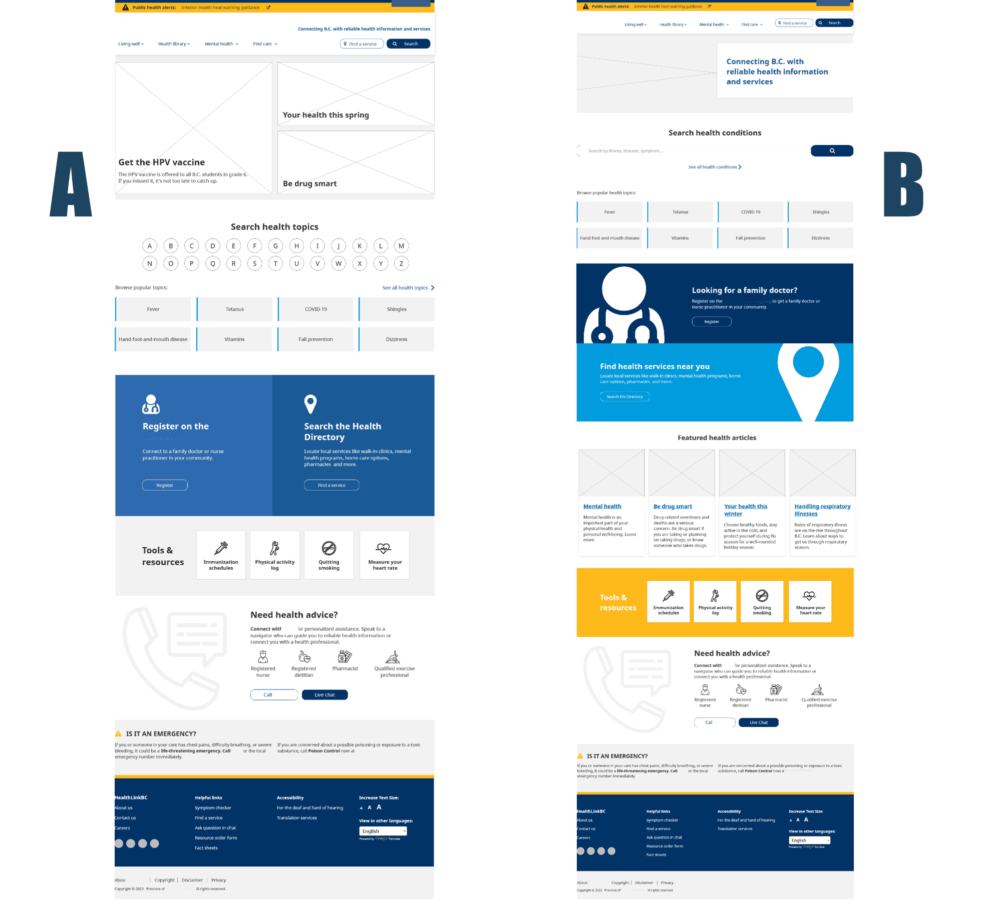
Discussing with the client, there were two designs that stood out. Which were used to conduct A/B virtual testing through Optimal Workshop recruitment of 25 participants. We wanted to test:
(1) The preference on alphabet search or search bar and why.
(2) The government preferred terminology or plain language.
(3) Preference on layouts and location of sections.
(4) Purpose on the website and based on a scenario how they would navigate in the website.
View website: https://www.healthlinkbc.ca/
to the top

